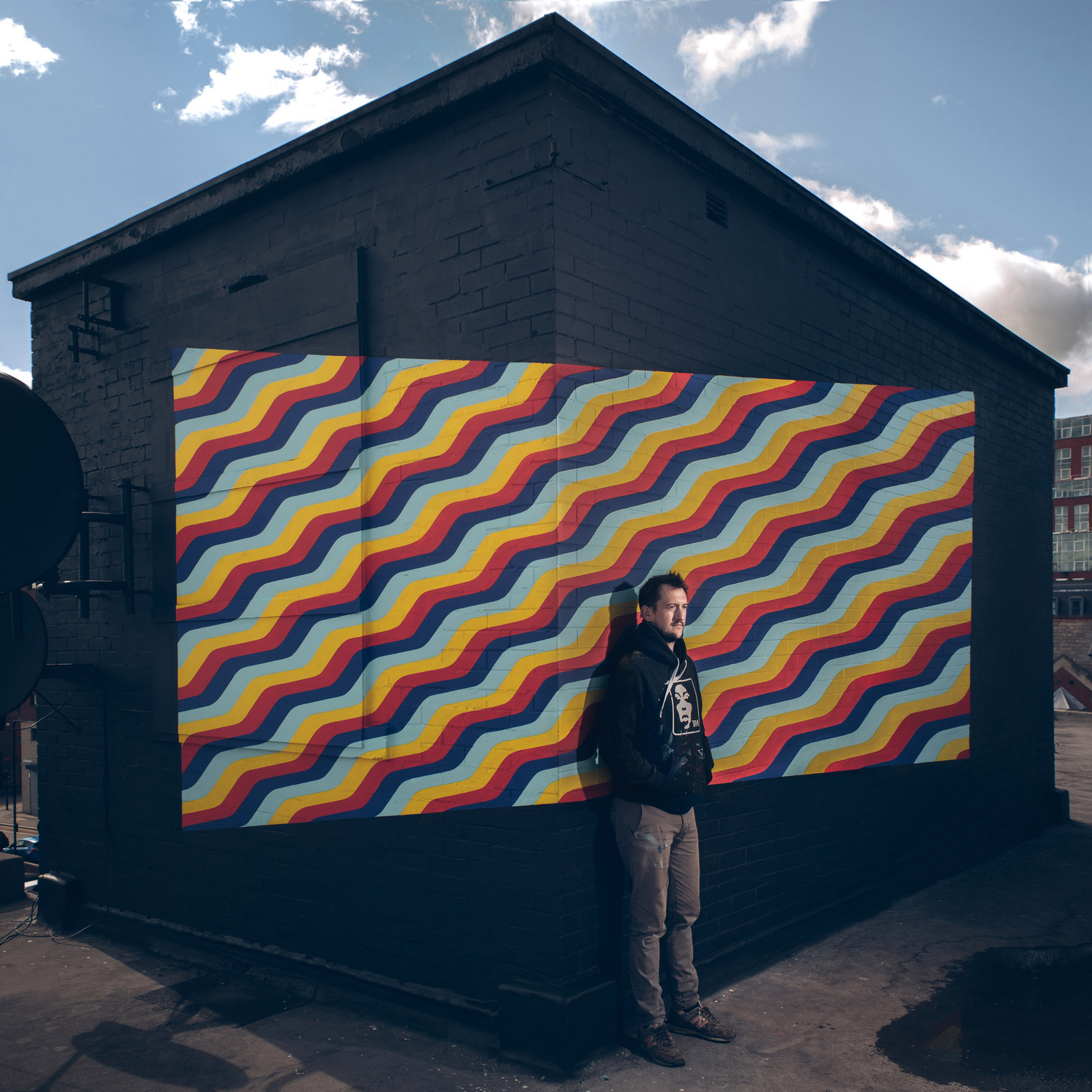
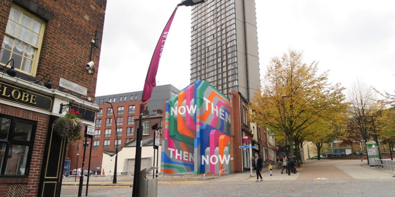
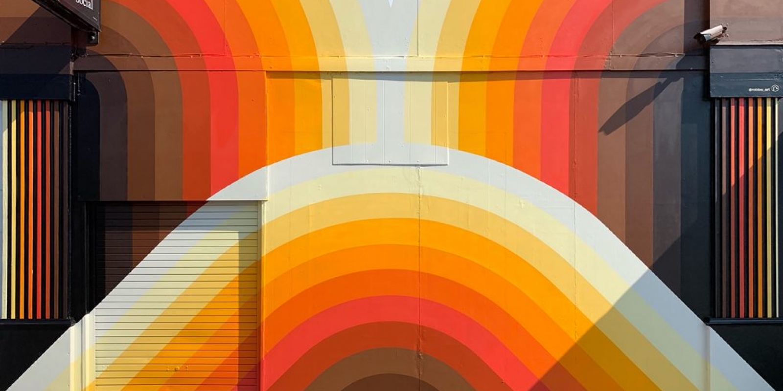
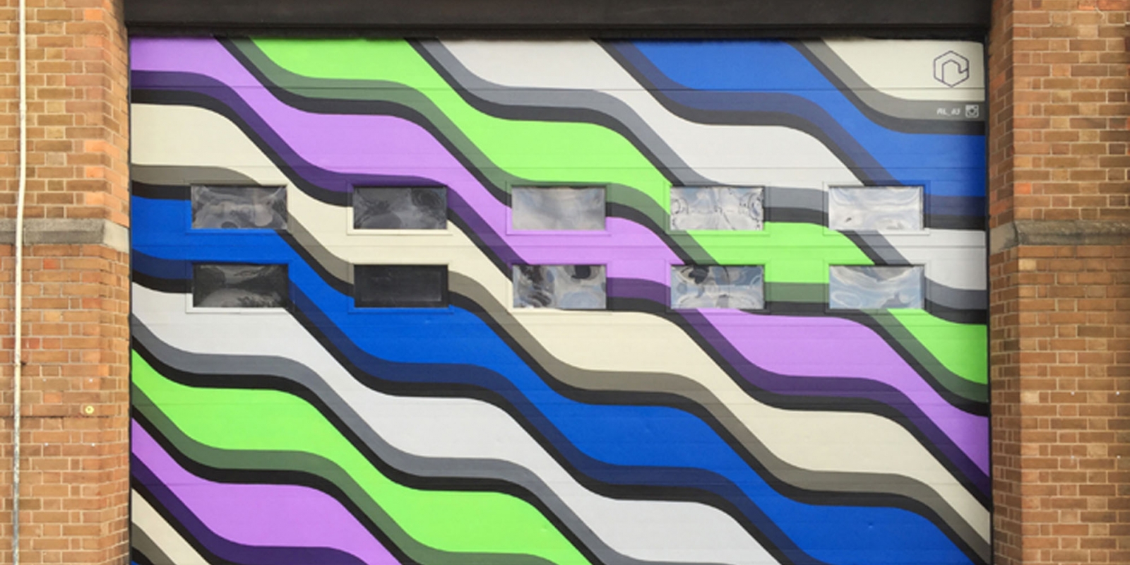
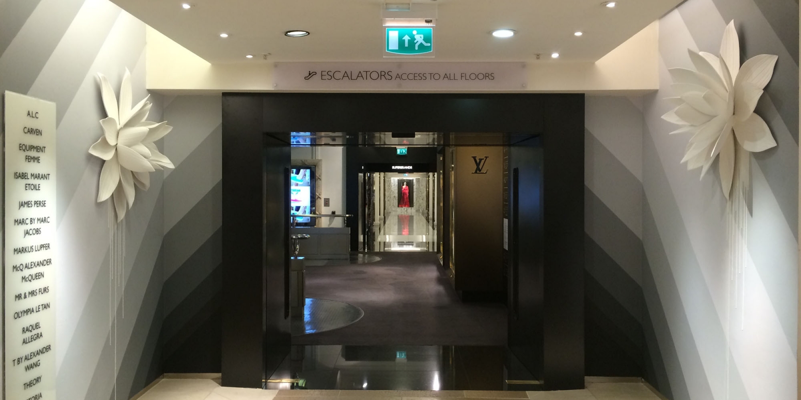
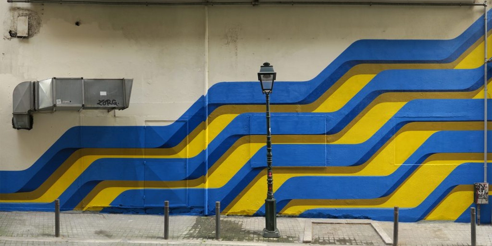
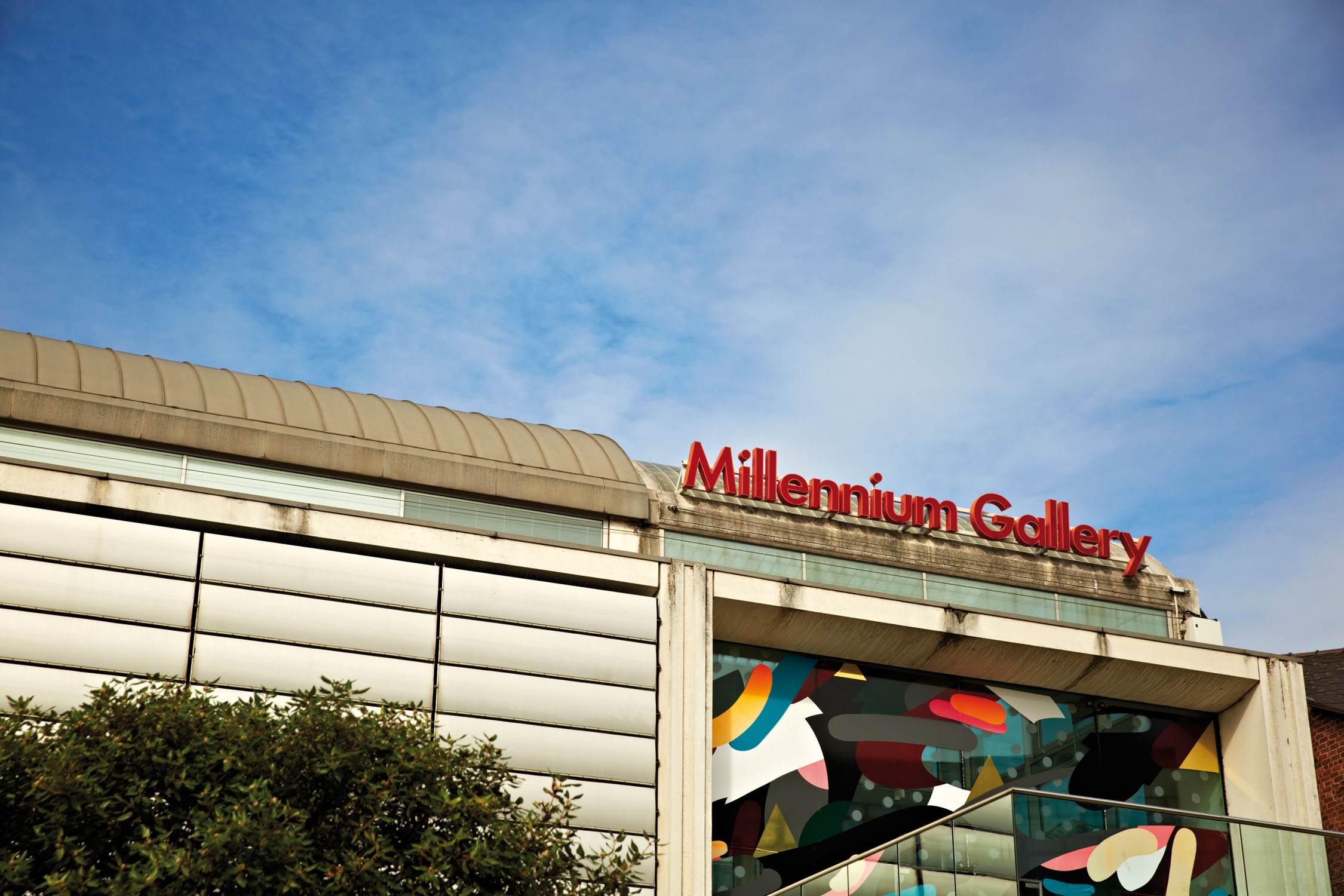
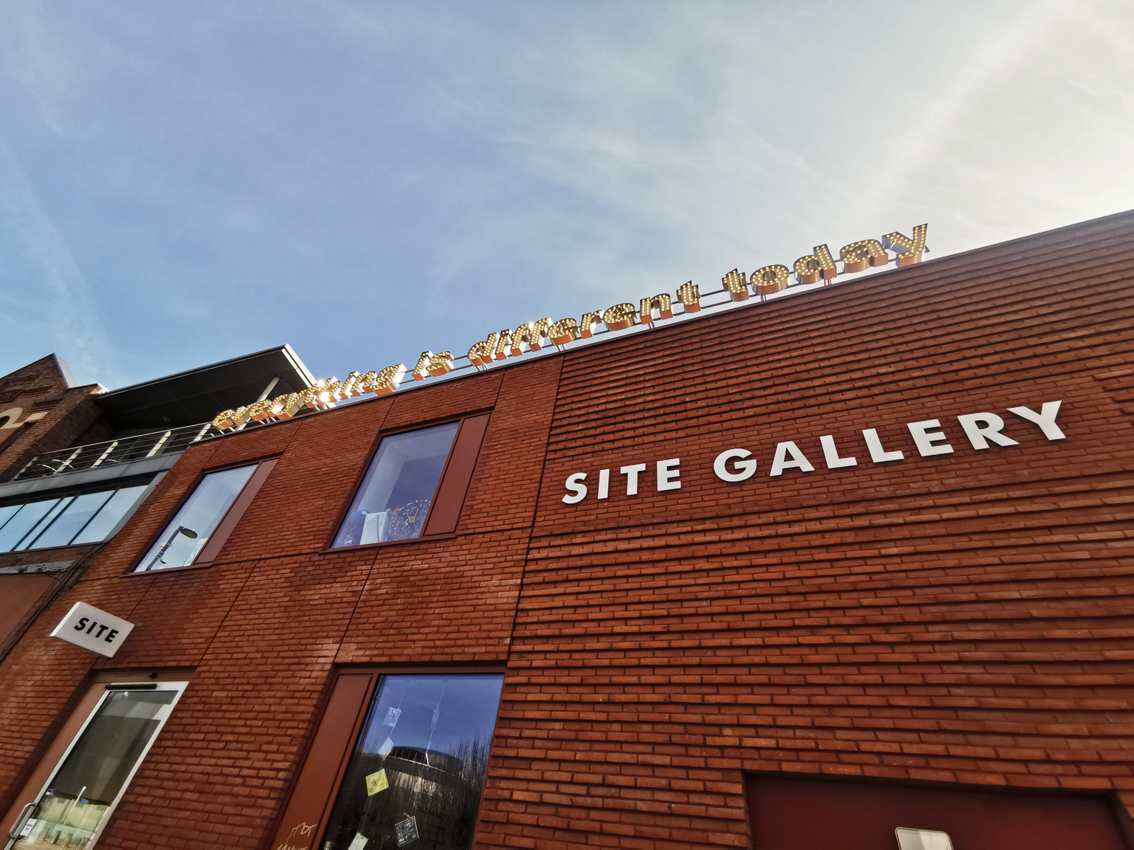
Using the distortion technique known as perspective anamorphosis, graphic artist Rob Lee's geometric optical illusions draw passersby in. Even his prints have 3D qualities: the bold graphic lines shift with your gaze, appearing to jump off the page. And his egalitarian ethos adds to the charm of his work – Rob's created murals and installations for such establishments as Harrods as well as, more locally, social kitchen Foodhall, Now Then magazine, Division Street vintage shop Vulgar, and Abbeydale Road's pizza, ping pong and music bar Picture House Social.
You'll not be able to help yourself from becoming immersed in Rob’s designs.
Update: since publishing this interview, Rob has won the 2019 Sheffield Design Award for Public Art. Before the lockdown, he started work on a major commission for Kirkgate Market in Leeds, which he'll resume as soon as he can.
How would you describe your work?
Bright, bold, geometric and large-scale mural work with a heavy focus on design and aesthetic. The primary intention of my murals is to communicate positivity. I usually end up seeing abstract landscapes but only sometimes do I set out to create something figurative – I leave it to the viewer to interpret how they like. I started a study last year which is an ongoing project, exploring the effects of light and shade on colour – I’m fascinated by colour and the psychology of colour, experimenting with complementary and contrasting palettes. I tend to work in ways that require technical, drawn-out processes and I love creating work that appears simplistic; it's painstaking and sometimes a real test of patience, but the result is so much more rewarding because of it. I’m particularly interested in optical illusions and started exploring perspective anamorphosis some years ago, using it to create immersive pieces over a number of different surfaces that, when viewed from a specific position, alter the perspective entirely.
What inspires you?
Urban and natural landscapes, architecture, and repetition in architecture and nature. Also perspective and colour, good graphic design, animation, music, how we interact with the world, science fiction, the future...! My dad was a structural engineer; he always brought his work home with him and I would watch in awe as he drafted huge technical drawings. The precision and maths required to create these definitely rubbed off on me. I’ve always been interested in technological advancements but also, growing up next to the Peak District, nature has always been close to my heart. Human capability astounds me but our greed is just as apparent. We need to use our technological abilities to help the planet not destroy it further; I attempt to communicate this theme in my work, with a fusion of man and nature, looking to a positive future.
What’s your workspace like?
I have a studio in the Avec building right next to Yorkshire Artspace's Persistence Works. I’m very fond of my space as I pretty much built it from scratch. I took it on through CADS' Space Cadets scheme – I must thank them as without it I wouldn’t have been able to realise some of the larger, more ambitious projects I've worked on over the last couple of years. It’s kind of one third office/design space, one third workshop, one third comfy chill-out. It's still a work in progress and a right mess!
What do you love about Sheffield?
Like most, I love how friendly Sheffield is. It’s a very safe city. I like how much creativity there is and, although it’s still very hard work, it’s a great place to establish yourself as an artist.
What would you do to improve the city?
Having lived here most of my life, I’ve seen the evolution of Sheffield and its surroundings and it very much feels like Sheffield is lagging behind now. I've had a pretty unique part-time job for the last few years which involves travelling around the entire city on a weekly basis. All I can see now are empty buildings everywhere. To feel full and thriving again, Sheffield really needs more business to set up or relocate locate here. A true cultural quarter would be amazing. The architecture could improve too – some new buildings (definitely not all) under construction are bland and "safe". I’d love there to be huge, colourful street art everywhere you look! And I’d like to be one of those who paints it!
Written by Holly Hinchcliffe


